Basic Design Principles
.avif)
UX design is more than just making something aesthetically pleasing. It is about creating an intuitive and user-friendly interaction through the understanding of both user needs and design principles.
I’m not trying to turn you into a design guru - there are other guides for that. But I will suggest some of the most fundamental principles, ones which I often see indie creators fail to adhere to, which can very quickly change how your product feels.
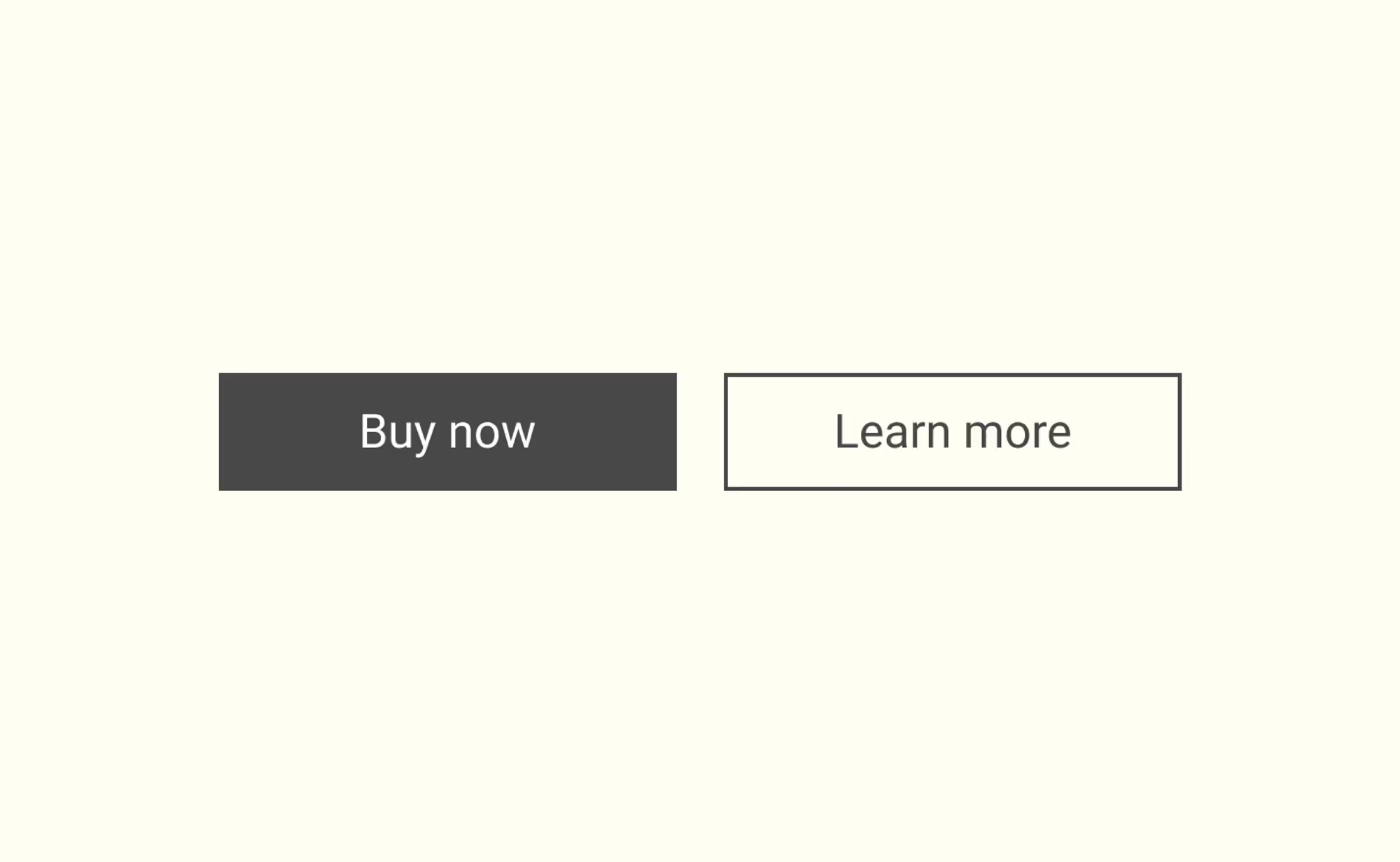
Contrast
Contrast is more than just a difference in colours. It refers to making distinctive elements stand out to draw user attention. For example, main navigation buttons should be clearly distinguishable from secondary or less important options.
Repetition
Repetition entails consistency.
Repeating the same pattern, colour, or font across different pages or parts of your app will create a sense of cohesive and predictable experience.
It reduces confusion and the learning curve for users. The consistency of your design makes your product more professional and trustworthy to your users.

Alignment
Alignment not only contributes to the aesthetic aspect of design but also guides a user's journey via visual cues.
Proper alignment makes the layout clean and organised, leading users to follow the structure intuitively and not become visually overwhelmed.
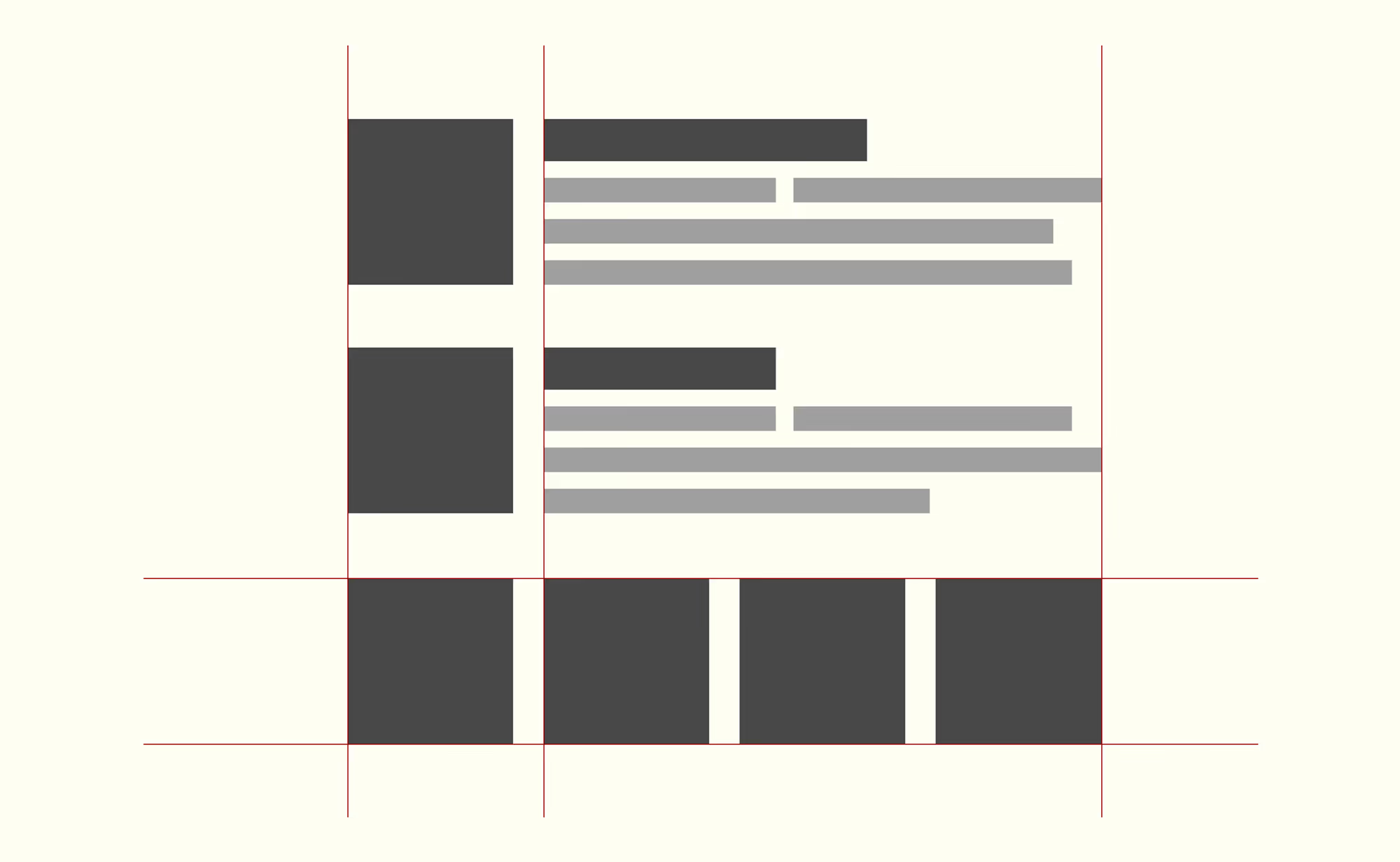
Proximity
Proximity deals with grouping related items together.
Placing elements that relate to each other near each other aids the user in understanding the relationship between those items. For example, a product tile should be close to other product tiles if they are related, interoperable, or come as a set.

Understanding and applying these basic principles can greatly enhance your users’ experience, making your product not only visually pleasant but also user-friendly and intuitive. Style has an impact on usability. Aesthetically pleasing things tend to lead the user to believe they work better.
Ultimately, these principles all add up to one thing: consistency. And consistency is quite difficult to achieve. My recommendation for achieving consistency with less effort and budget is to adopt a design system or UI framework.
There are many popular ones, including (in no particular order):
It doesn’t mean you have to copy the frameworks entirely - you should customise them and add your own components too. But these frameworks cut out a lot of the boilerplate design work, which tends to be the root of a lot of inconsistency.
Actionable Steps
- Review your current website or app, identifying where you might be breaking the Contrast, Repetition, Alignment and Proximity principles.
- Make time to fix one of these issues at a time (even if it’s just one principle in one part of your product).
- Review the UI libraries to see if any would suffice as the underlying interface for your product.