Common Mistakes Startups Make in Their Hero Section and How to Fix Them
The hero section is the first thing visitors see when they land on your website.
For startups, it’s crucial that this section grabs attention, communicates your value proposition, and encourages further engagement.
Unfortunately, many startups make critical mistakes in this area. Here’s a look at some common errors and how to fix them.
1. Lack of Clarity in the Value Proposition
Mistake: The hero section fails to clearly communicate what the startup does and the value it offers. This often happens due to vague or jargon-heavy language, or when a startup's looking to speak to multiple personas on one page.
Fix: Keep your messaging clear and concise. Your headline should state what you do and the benefits you provide in simple terms. For example, instead of "Revolutionising the Financial Ecosystem" use "Send and Receive Payments in Minutes".
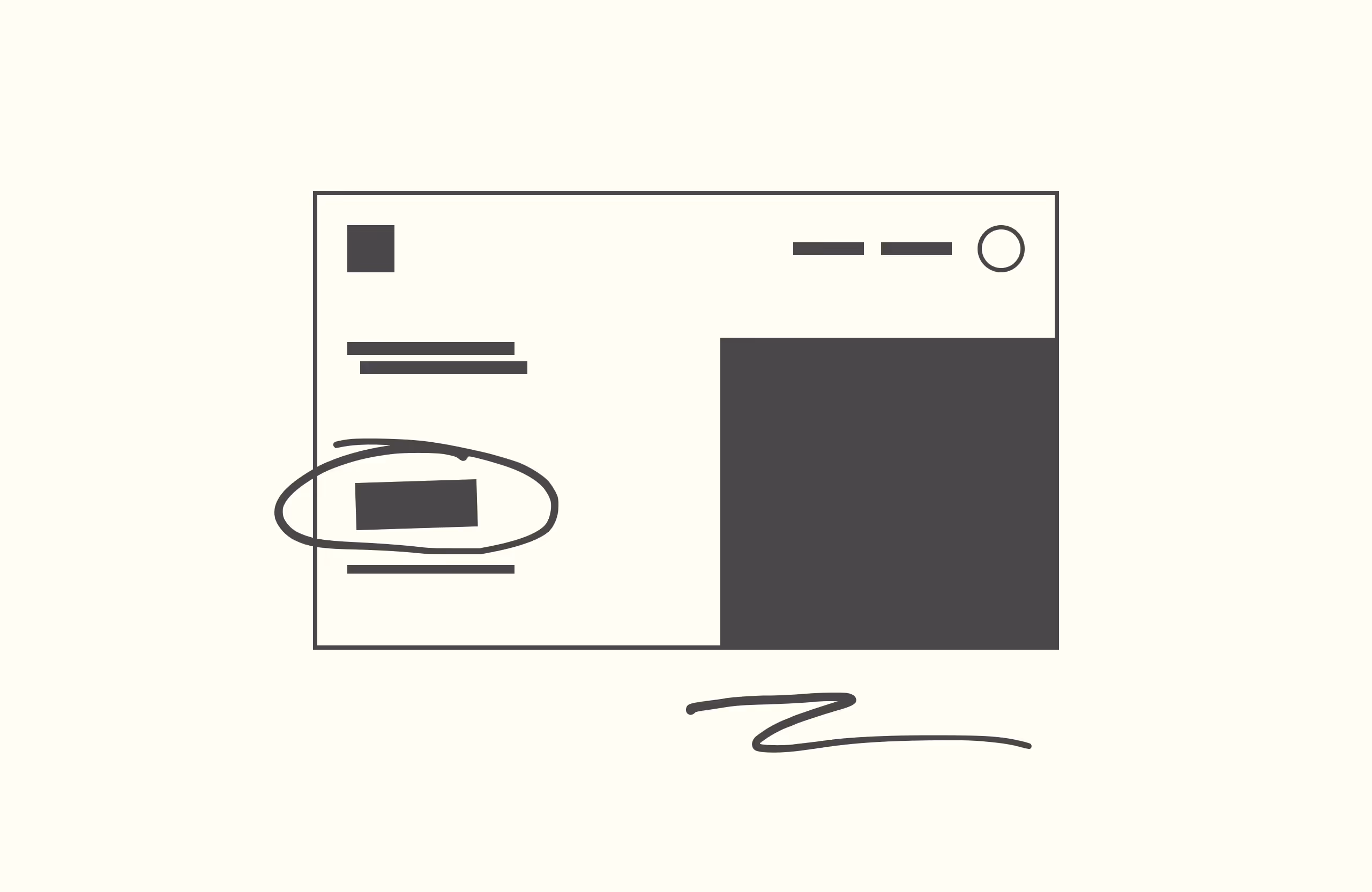
2. Poor Visual Hierarchy
Mistake: Important elements like the headline, call-to-action (CTA), and supporting visuals are not prioritised, making the section look cluttered and confusing. Even worse: all elements have a similar contrast to each other, visually overloading the user.
Fix: Establish a clear visual hierarchy. The headline should be the most prominent element, followed by an explanation of the product/service, and then the CTA. Use contrasting colours, font sizes and ample white space to guide the user's eye to the most important information.
3. Ineffective Call-to-Action (CTA)
Mistake: The CTA is either missing, vague, or not compelling enough to encourage user action.
Fix: Make your CTA clear, actionable, and visible. Use action-oriented language like "Book a demo," "Sign up," or "Try for free". Place it prominently and ensure it stands out with a contrasting colour or button style.
4. Overloading with Information
Mistake: Trying to include too much information in the hero section, which overwhelms visitors and dilutes the key message.
Fix: Focus on the essentials. Your hero section should introduce your product, assert why you should be trusted with social proof, and entice visitors to take action or learn more about it. Additional information can be provided further down the page. Use short, impactful text and strong visuals to make your point.
5. Low-Quality or Irrelevant Imagery
Mistake: Using stock photos, mixing illustration/art styles or low-quality images that don’t relate to your product or audience.
Fix: Invest in high-quality, consistent visuals that reflect your brand and resonate with your target audience. Custom illustrations, product screenshots, or high-quality photos of real users can make a significant impact.
6. Ignoring Mobile Optimisation
Mistake: Designing the hero section primarily for desktop users and neglecting how it appears on mobile devices.
Fix: Ensure your hero section is fully responsive. Test it on various devices to make sure it looks great and functions well on all screen sizes. Mobile users should have an equally compelling experience as desktop users. In some cases you might want to have specific components shown or hidden based on whether the user is at a mobile or desktop breakpoint, so you can tailor the mobile experience.
7. Slow Loading Times
Mistake: Including heavy images, GIFs or videos that slow down the page loading time, leading to high bounce rates.
Fix: Optimise images and use efficient coding practices to ensure fast loading times. Tools like Google PageSpeed Insights can help identify and resolve loading issues. Fast-loading pages improve user experience and SEO performance. For animations, consider alternatives to GIFs like Lottie files, which are lighter-weight and higher quality.
8. Lack of Social Proof
Mistake: Missing out on the opportunity to build trust by not including any social proof such as testimonials, logos of reputable clients, or user statistics.
Fix: Incorporate elements of social proof in your hero section to build credibility. A short testimonial, a few high-profile client logos, or impressive usage stats can make your startup appear more trustworthy and established.
Conclusion
By avoiding these common mistakes and implementing the suggested fixes, you can create a compelling, user-friendly, and effective hero section that attracts and engages visitors.
Simplicity, clarity, and visual appeal are key to making a strong first impression.
For more insights on improving your startup’s UX, feel free to book a call with us. With our design expertise, you can ensure every element of your site is optimised for success.