Simplifying Whenivity's Key User Journeys
We have been working in partnership with Whenivity since they had a beta version of their app almost complete.
Looking to launch in the coming months after subscribing to Lightning UX, we set out to immediately understand where their beta app could be improved before public release.
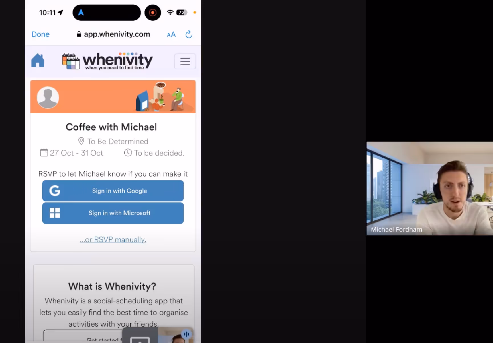
We arranged and conducted live, remote user testing sessions with four individuals of ranging demographics and differing devices (smartphones and desktops). We originally planned for five user testing sessions, but we began to see the most common patterns after the fourth was concluded, so decided to summarise the results for Whenivity sooner.
After we concluded the sessions, we put together an in-depth report consisting of quotes, screenshots, user recordings and key takeaways for Whenivity to review.
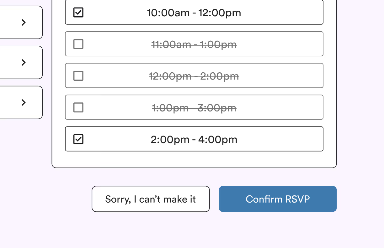
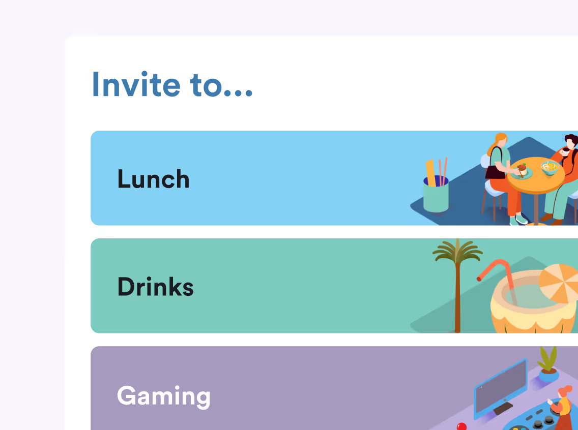
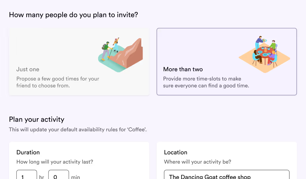
From there, we agreed upon how to strategically improve the app, and began designing some refined interfaces.
Day-by-day, designs were delivered to Whenivity who then quickly iterated on their app and implemented them.
At the time of this report, Whenivity have almost completed the first full build of their new experience, with a launch anticipated in weeks.